Colors are a major part of our world, we are visual creatures after all! So when it comes to the office, the colors you choose can have a profound impact on productivity and morale. It’s tough to know where to start, so use this guide to help you choose!
First Thing’s First – The Message

You may have heard of color psychology – the study of hues as a determinant of human behavior. While our perceptions of color vary based on individual and cultural experience, there is still a fairly strong standard of what colors signify. Yellow is a happy color, black is a brooding color, green is a fresh color, groundbreaking stuff right? When you want to add or change colors in the workplace, start with the message you want to send. Are you a serious, well-established law firm? Are you a fun, creative studio, shaping the world through positive design? Are you a bank with the utmost integrity? Consider what you want your space to say about your brand, and choose colors that evoke this message.
It’s Not Just the Color, It’s the Intensity
So you’ve picked colors that are sending the right message, but that’s not enough. Which shade you pick also sends its own message, and has its own uses.
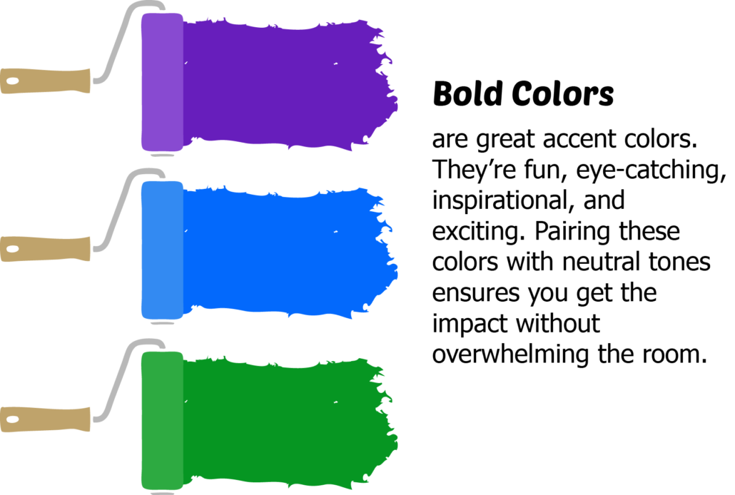
Bold colors are great, they’re exciting and fun and can’t be ignored- but that doesn’t mean your staff wants to see hot pink everywhere they look. These work best as accents, like one wall or a stripe.
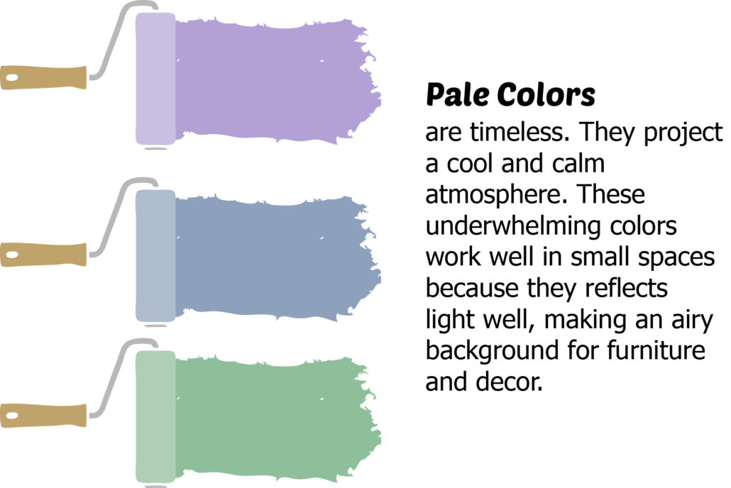
Pale colors are the most common and easiest choice – it’s hard to mess up something you don’t really notice. These are great for the majority of your space because they blend in very well. If you’ve got small rooms, or rooms with no windows, pale colors are your best bet for reflecting light, giving rooms an airy feel.
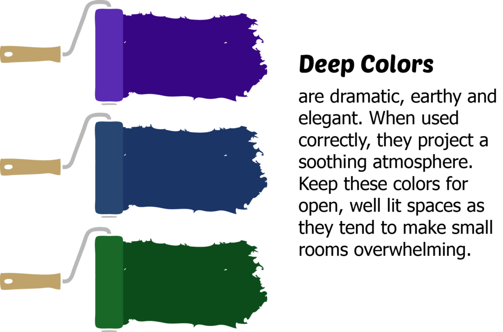
Deep Colors get noticed. They make a dramatic statement without screaming “Look At Me!” These rich and soothing tones work well for spaces that are down-to-earth, established, and strong. Avoid painting those small, windowless rooms with these colors as they will just make everyone a little claustrophobic. If you have an open floor plan, these colors can help tie the room together without drowning everything out.
60-30-10
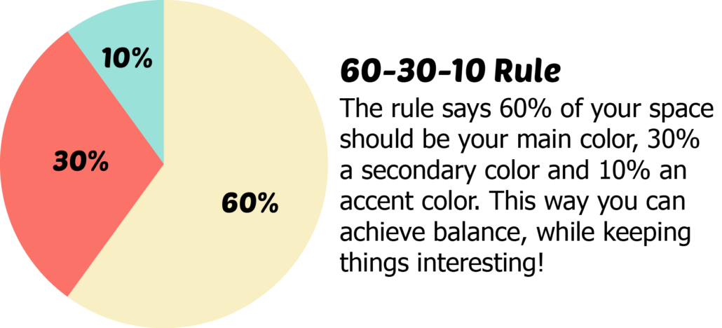
If you’ve studied design, you’ve probably heard this rule. 60% of your space should be the main color, 30% the secondary color, and 10% the accent color. This is a great tip to keep in mind, so you don’t go overboard with that bright turquoise, but still get to incorporate it throughout your space. Good design is about balance, and it goes beyond your walls. This rule applies to everything from the panels on cubicles to the couches in the lobby.
The Last Bits – Furniture, Accessories, and Branding
Luckily, furniture manufacturers know that people love color! You have access to countless colorful chairs, panels, and accessories. Textile manufacturers use literally every color in the book, allowing you to choose fabrics that will tie the whole space together. Why not choose neutral colored furniture that allow for replaceable panels and cushions, so you can change it up down the road, without having to throw the whole lot out.
The whole point of a well designed office is to help your company succeed. Whether it’s inspiring employees, increasing productivity, or impressing clients, your office needs to be all about your organization. If your company’s colors are red and yellow, it’s probably smarter to include those in your design than making everything purple. This isn’t to say that the office should look like a fast food chain, but tying in these colors can subtly reinforce your brand.
So Go Forth! Paint the office red! Or blue! Green! Coral is in this year, so make a splash! Delight your clients and employees with a change of pace! If you need help, well, Rose City is just a phone call away!

